STATUS:
LIVE
ThePackengers
Website Redesign
Framer Development
SEO & Performance Optimization
Customer Portal Design
Partner Widget Redesign
Design System
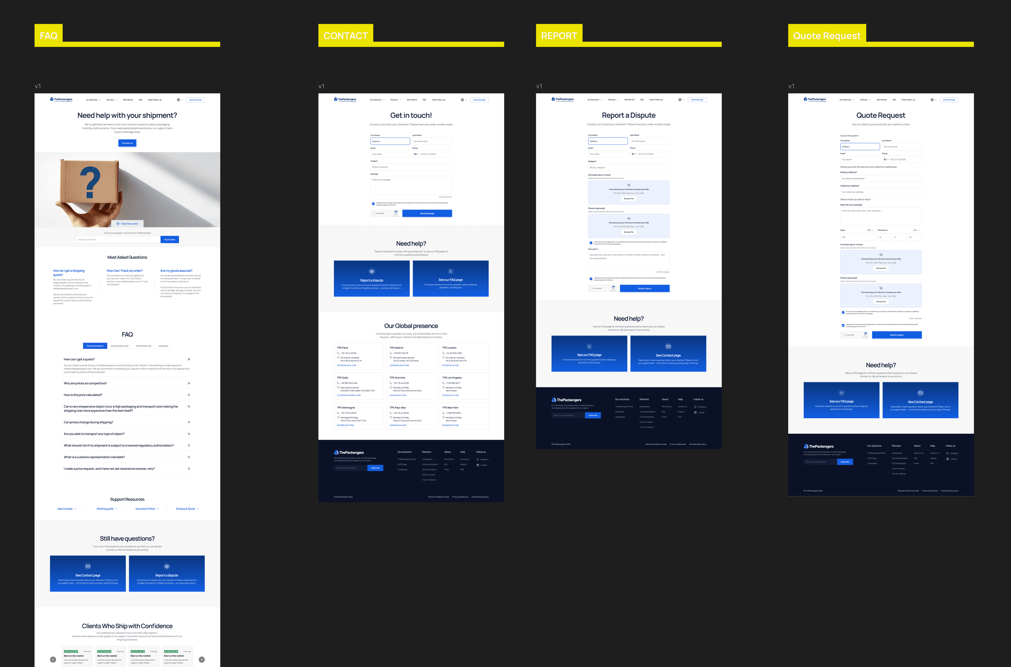
Redesigned the website with stronger storytelling, clearer service hierarchy, modern UI, and improved navigation.
What began as a Figma redesign evolved into a complete Framer website after I recommended it over Wix and Squarespace to better support the team's need for design flexibility and frequent content updates. I designed and built the site independently, collaborating with engineers only on backend integrations. The design system and visual identity I created later became the foundation for the customer portal, widgets, and internal tools.
ROLE
Founding Product Designer & Framer Developer
DURATION
1 Year in parallel with other products
TEAM
Product Owner · PM · Engineers
3
surfaces unified — website, portal, widget
1
designer & developer — no handoff for the website
7
products shipped across the ecosystem
260k+
active users served

THE CHALLENGE
Three audiences, one outdated front door.
Outdated identity
The interface lacked consistency and didn't communicate the quality of the service.
Growing ecosystem
Snap&Go, Loopengers, and partner services needed introducing without overwhelming visitors.
Multiple user groups
Customers, partners, and returning clients each needed clearer navigation and dedicated experiences.

WHAT I DID
Rebuilt around customer journeys, not company information.
2
booking paths, matched to customer scenarios
Simplified quote requests
With buyer invoice: fewer steps through automatic information extraction. Without: a simplified manual form. Less effort for every customer type.
~30
portal screens in 2 months, via design system reuse
Grew a list into a dashboard
Redesigned a basic order list into full self-service: tracking, documents, invoices, saved addresses, rewards, and referrals shipped fast because the system already existed.
3
steps in the rebuilt partner booking flow
Rebuilt the partner widget
Address autocomplete, a clear booking summary, real feedback states and dedicated partner pages that stopped treating partners as a secondary audience.
2
product launches introduced
Made room for what's next
New product pages introduced Snap&Go and Loopengers to the market, with trust built throughout company metrics, a real About page, page-specific calls to action.


OUTCOMES
260k+
users across the ecosystem
70%
fewer engineering clarification requests, TPK-wide
3
shipped products supported by the system
1
design system across every surface
A marketing website designed and deployed by me in Framer, a customer portal grown into full self-service, and a rebuilt partner widget — all on one design system. The consistency work paid forward: every later product launched faster because the foundations already existed.
REFLECTION
What I learned
Consistency goes beyond visual design. Unifying three surfaces around one system created a cohesive customer experience and made every future improvement easier to scale.
What I'd do differently
I invested heavily in technical performance — speed, SEO, optimization. Next time I'd rebalance that time toward more design review cycles. Performance made the site fast; more reviews would have made it sharper.
See Next Project

Redesigned the end-to-end quote experience, introduced AI-assisted package dimension capture, simplified user flows, and created a scalable design system.
View Project
View Project

Translated GitHub specifications into user flows, wireframes, information architecture, and complete product designs.
View Project
View Project